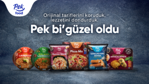
Our story started with our aim to present you with the most original recipes in the most delicious way. In this way, the subject of our story is to protect the regional richness of our country, which has become and is a candidate to be universal, with our selections from world cuisine, to protect these values and to interpret them in our own way.
We wanted to reflect ourselves on every detail of our story, and we started with our logo first. The logo we designed, inspired by the most original recipes of Pek Food flavors, is a reflection of traditionalism and naturalness…
We wanted our font, which symbolizes warmth and sincerity, to describe not only our name but also our character. The happiness and taste represented by the sloping line became the symbol of the passion in the products we offer you with the rise to the right in the slope. The heart of our logo was the response to the happiness that appeared on the faces with the first bite of our products.
The dark blue and blue tones we used were the color codes of the confidence we gave you, the determination in our work, and our professionalism. We wanted not only our tastes but also our story to be all too special today. Now we are where we want to be.
Pek Food.
It happened all too nice…


